A website can look polished and still leave visitors unsure about what to do next. Confusing navigation, crowded layouts, difficult forms, and unclear service information can turn an otherwise useful website into a frustrating experience. Effective design addresses these problems by making information easier to understand and important actions easier to complete.
The 7 principles of web design provide a practical foundation for building websites that balance visual appeal with usability. These principles include visual hierarchy, balance, contrast, consistency, alignment, proximity, and accessibility. When applied thoughtfully, they help visitors understand a page, locate relevant information, and move through a website with less effort.
For healthcare providers, these decisions carry particular importance. Patients may visit a clinic website to compare services, understand appointment options, check opening hours, or find contact details. A clear design helps them complete these tasks without unnecessary confusion.
This guide explains seven essential principles, how they influence website user experience, and how businesses can apply them when planning or improving a website.
1. Establish Visual Hierarchy to Guide Visitors
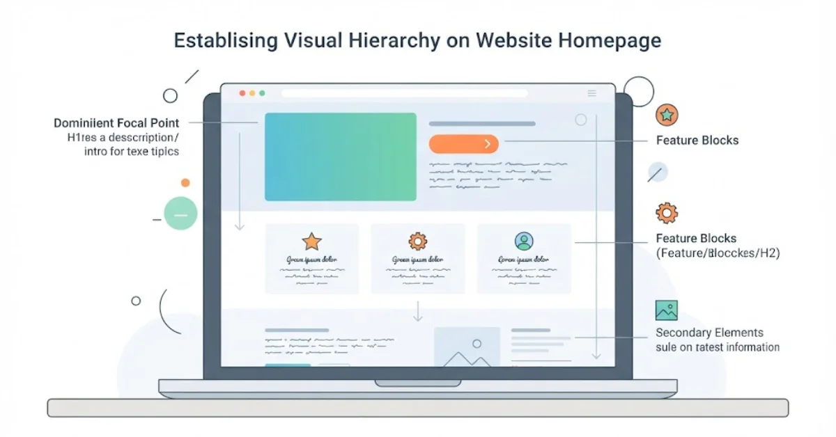
Visual hierarchy determines which information attracts attention first, what visitors notice next, and how they understand the relationship between different elements. Without a clear hierarchy, every heading, image, button, and paragraph can compete for attention.
A well-organized page gives the most important information appropriate prominence. Page titles introduce the subject, subheadings divide the content into understandable sections, and supporting text provides additional detail. Font size, spacing, positioning, and contrast help establish these relationships.
For example, a clinic homepage might introduce its main services, explain who the clinic helps, and provide a clear route to appointment information. Visitors should not have to search through unrelated promotional banners to discover what the clinic offers.
The same principle applies to headings throughout a website. A logical H1, H2, and H3 structure improves readability and makes the content easier to scan. Headings should describe the section that follows rather than exist simply to accommodate keywords.
Practical takeaway: Identify the primary question a visitor needs answered on each page. Make that information easy to find before adding secondary details.
2. Create Balance Without Overcrowding the Page
Balance describes how visual elements are distributed across a layout. A balanced design feels organized, while an unbalanced page may appear cluttered, empty, or difficult to follow.
Symmetrical layouts place similar visual weight on either side of a composition. Asymmetrical layouts use different elements to create balance through their size, position, color, or spacing. Both approaches can work well when they support the purpose of the page.
Consider a clinic website featuring a short introduction beside a relevant photograph. The text and image can complement one another without competing for attention. On a service page, a readable content column with supporting details in a secondary area may help visitors focus on the information they need.
Balance also involves restraint. Too many promotional banners, animations, decorative icons, or competing calls to action can distract visitors from the page’s purpose.
Practical takeaway: Review each page as a complete composition. Remove visual elements that do not help explain the service, build understanding, or support the visitor’s next step.
3. Use Contrast to Improve Readability and Focus
Contrast helps distinguish one element from another. Designers create it through differences in color, size, weight, shape, and spacing. Used carefully, contrast makes important information easier to identify.
Text contrast is particularly important. Pale text on a light background or small lettering over a busy photograph can make information difficult to read. Buttons also need sufficient contrast to remain identifiable against the surrounding layout.
A clinic website might use a consistent accent color for its primary appointment button while keeping secondary links visually quieter. This gives visitors a clear indication of the intended action without making every element appear equally urgent.
Contrast should not depend on color alone. Labels, icons, text, and clear interaction states help people understand information even when they cannot easily distinguish particular colors.
Practical takeaway: Check text and interface elements against their backgrounds. WCAG 2.2 provides established accessibility criteria, including minimum contrast requirements for many types of text.
4. Maintain Consistency Across Pages and Interactions
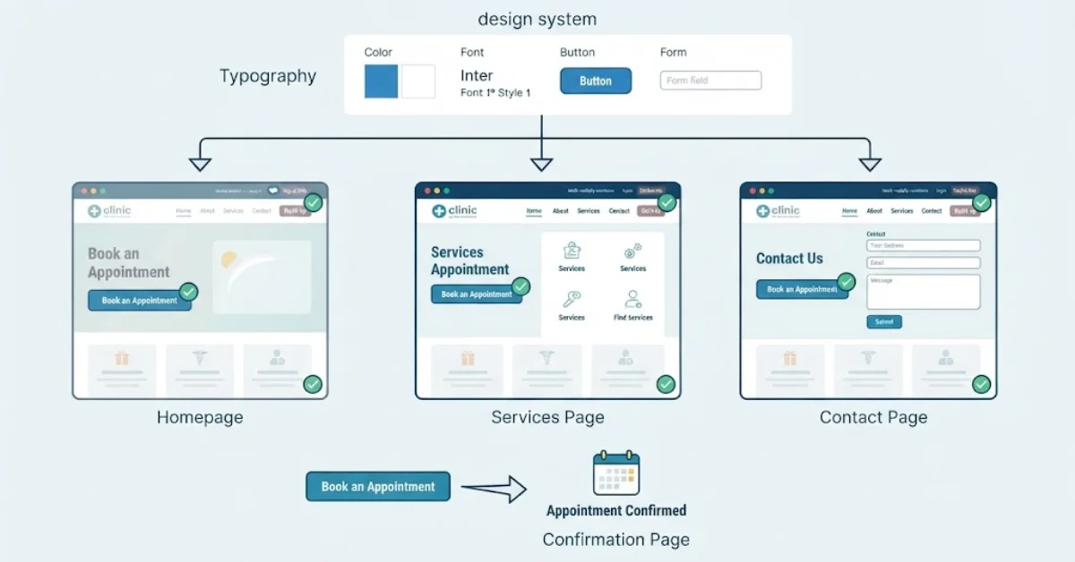
Consistency allows visitors to learn how a website works and apply that knowledge as they move between pages. When similar elements look and behave differently without a clear reason, people must repeatedly work out how to use the interface.
A consistent design system establishes rules for typography, colors, buttons, navigation, spacing, forms, and other reusable elements. These rules help the website feel connected, even when its pages serve different purposes.
For example, if the main navigation appears at the top of the homepage, visitors generally expect it to remain in a familiar position on service and contact pages. Appointment buttons should use predictable labels, and form fields should behave consistently.
Consistency also applies to language. A button labelled “Book an Appointment” should lead to an appointment-related action, not an unrelated page. Clear labels set accurate expectations and reduce uncertainty.
This does not mean every page must look identical. A service page may need a different layout from a team profile, but both should follow the same underlying design language.
Explore our US biotech website design services to learn more about designing professional, user-focused websites.
Practical takeaway: Create reusable components and document the design rules before expanding a website. This makes future updates easier to manage and helps preserve a coherent experience.
5. Use Alignment and Proximity to Organize Information
Alignment and proximity work together to make a page easier to understand. Alignment creates visual order by positioning elements along consistent edges or reference points. Proximity groups related information so visitors can recognize which items belong together.
When text blocks, images, buttons, and headings follow a clear grid, the layout feels intentional. In contrast, inconsistent spacing and arbitrary positioning can make a page appear disorganized.
Proximity helps visitors interpret relationships. A service heading should sit close enough to its description to make the connection obvious. Contact details should be grouped together, while unrelated information should have enough separation to avoid confusion.
These principles are particularly useful for forms. A field label should remain visually associated with its input, and instructions should appear close to the field they explain. Error messages should identify the relevant problem rather than appearing in an unrelated part of the page.
Good spacing also creates breathing room. White space is not wasted space; it helps separate ideas and reduces the feeling that visitors must process everything at once.
Practical takeaway: Check whether a visitor can quickly identify which heading belongs to each paragraph, which label belongs to each form field, and which actions relate to one another.
6. Prioritize Accessibility and Responsive Design
A useful website should accommodate different devices, abilities, and browsing conditions. Accessibility and responsive design are therefore fundamental parts of the design process, not finishing touches.
Responsive layouts adapt to different screen sizes, allowing content to remain readable and functional on phones, tablets, and desktop computers. Navigation should remain usable on smaller screens, images should scale appropriately, and buttons should be easy to operate with touch input.
Accessibility addresses additional barriers. Visitors may navigate using a keyboard, rely on screen-reading software, zoom into text, or need clearer instructions to complete a task. Semantic headings, meaningful link text, descriptive image alternatives, visible keyboard focus, and properly labelled form fields can make a substantial difference.
Healthcare websites should also pay attention to how sensitive information is collected. Appointment and intake forms should request only necessary information, explain their purpose, and use appropriate safeguards for the data involved.
Useful checks include:
- Test navigation and forms using a keyboard.
- Confirm that text remains readable when enlarged.
- Check contrast and descriptive labels.
- Test important tasks on mobile devices and slower connections.
- Review form errors to ensure visitors can understand and correct them.
Accessibility requirements depend on the applicable standards and circumstances. Following recognized guidance such as WCAG is a useful starting point, but an automated scan alone cannot establish that a website is fully accessible.
7. Make Usability the Measure of Good Design
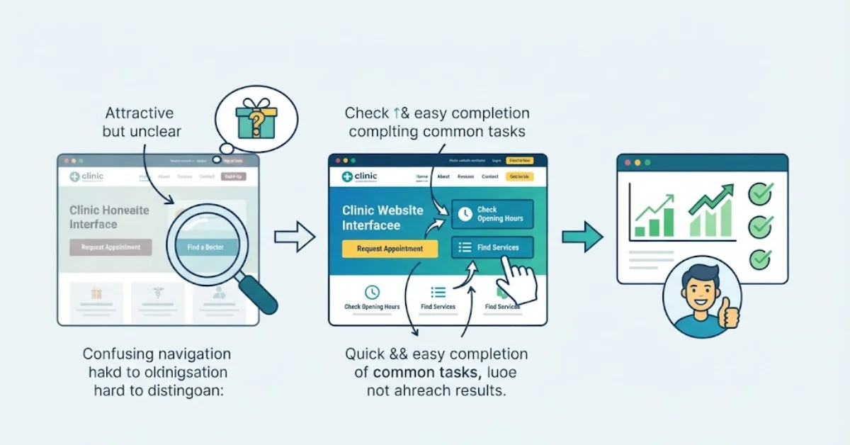
A visually attractive website is not necessarily an effective one. Usability depends on whether visitors can understand the interface, complete their intended tasks, and recover from mistakes without unnecessary difficulty.
This is where user experience basics become practical. Rather than assuming that a design works because it looks good, observe how people interact with it.
For a clinic website, relevant tasks might include finding a particular service, checking whether a clinic offers a specific treatment, locating opening hours, or understanding how to request an appointment. If visitors struggle to complete these actions, the design needs further attention.
The commonly discussed three-second rule in website design is best treated as a reminder to communicate quickly, not as a universal performance benchmark. Visitors should be able to understand the website’s purpose promptly, but there is no single time limit that determines whether every website succeeds.
Useful usability checks include watching where people hesitate, reviewing form abandonment, testing navigation labels, and checking whether mobile visitors can complete key tasks. Website analytics can reveal patterns, while direct usability testing helps explain why those patterns occur.
For businesses reviewing a redesign, the process matters as much as the finished interface. The seven phases of web design are often organized around discovery, planning, structure, visual design, development, testing, and launch, followed by ongoing maintenance. The exact process varies, but testing should take place before and after launch.
The best UX design principles are those that help people complete meaningful tasks with confidence. Visual polish matters, but it should support clarity, functionality, and the needs of the intended audience.