
A pharmaceutical website has a difficult job: it must communicate complex information clearly while giving visitors a straightforward digital experience. Patients, healthcare professionals, researchers, partners, and prospective clients may all arrive with different questions and expectations.
That is why a website can look modern and still have serious problems. Important information may be buried, pages may take too long to load, content may be difficult to understand, or search engines may struggle to interpret the site’s structure.
These issues are not solved by adding more pages or repeatedly inserting keywords. A better approach is to identify the specific problem affecting visitors and address its underlying cause.
This guide covers the most common pharmaceutical website problems, what causes them, and practical ways to improve the website without creating unnecessary complexity.
1. Visitors Cannot Find Important Information Quickly
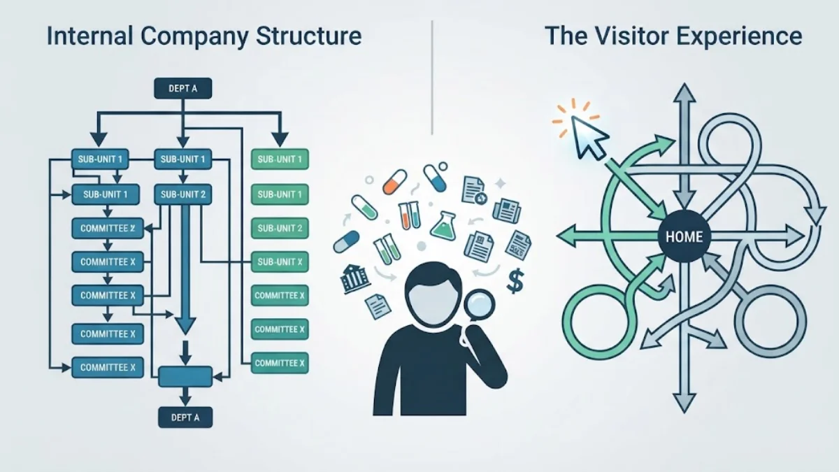
Pharmaceutical websites often contain a large amount of information. Product details, research, therapeutic areas, company information, publications, news, careers, resources, and contact information may all compete for attention.
The problem begins when the website’s structure reflects the company’s internal organization rather than what visitors are trying to accomplish.
For example, a visitor may know the name of a product but not know which internal department manages it. If finding that information requires several unclear clicks, the website creates unnecessary friction.
This is primarily a pharma website navigation problem.
How to fix the structure
Organize the website around recognizable visitor needs. Use straightforward navigation labels, logical categories, descriptive page titles, and relevant internal links. Important resources should not be buried several levels below the homepage.
A website search function can also be valuable when the organization publishes a substantial number of documents, products, publications, or research resources.
The objective is simple: visitors should be able to understand where they are and where to go next without having to learn how the company is organized.
2. The Website Is Slow, Especially on Mobile
Speed problems can remain hidden when a website is tested only on a fast office connection or a powerful computer. Real visitors may access the site from smartphones, slower networks, or older devices.
Large images, unnecessary scripts, inefficient code, excessive plugins, and poorly optimized fonts can all contribute to slower pages.
This is an important part of pharmaceutical website optimization because performance affects the overall experience before visitors even begin reading the content.
Mobile performance deserves separate attention. A responsive website is not automatically a fast website. Text may fit the screen correctly while images, scripts, forms, or interactive elements still create delays.
A practical performance review should examine the largest page assets, unused resources, image dimensions, caching, third-party scripts, server response time, and mobile rendering.
The goal is not to make every page minimal. It is to ensure that the resources being loaded provide genuine value to the visitor.
3. The Content Is Accurate but Difficult to Understand
Pharmaceutical information often has to communicate scientific and technical subjects. That does not mean every page should be difficult to read.
One common problem is content written primarily for specialists when the website also needs to communicate with broader audiences. Another is the opposite: pages contain so little useful information that visitors cannot understand the organization’s expertise or purpose.
Strong pharmaceutical website content should be accurate, purposeful, and appropriate for its audience.
A company overview should explain what the organization does. A research page should provide meaningful information about the relevant area of work. A product-related page should organize appropriate information clearly rather than forcing visitors to search through unrelated corporate material.
Credibility also matters. Where appropriate, pharmaceutical websites can strengthen trust by providing clear company information, responsible authorship, supporting references, relevant publications, dates, professional credentials, and transparent contact information.
The objective is not to make content longer. It is to make every important page useful.
4. Accessibility Problems Make Information Harder to Use
Accessibility is sometimes treated as a technical requirement added after a website has already been designed. That approach can leave basic usability problems embedded throughout the site.
Visitors may encounter insufficient color contrast, unclear form labels, poorly structured headings, missing alternative text, keyboard-navigation difficulties, or interactive elements that are difficult to understand.
Pharmaceutical website accessibility should be considered from the beginning of the design process.
Clear heading structures help people scan content. Descriptive links tell visitors what will happen when they click. Properly labeled forms make contact processes easier to understand. Readable typography and adequate contrast improve the experience for a much wider audience.
Accessibility improvements also tend to support general usability because they make information and interactions clearer for everyone.
A professional website review should therefore evaluate accessibility alongside design rather than treating it as a separate final-stage task.
5. Search Engines Cannot Clearly Understand the Website
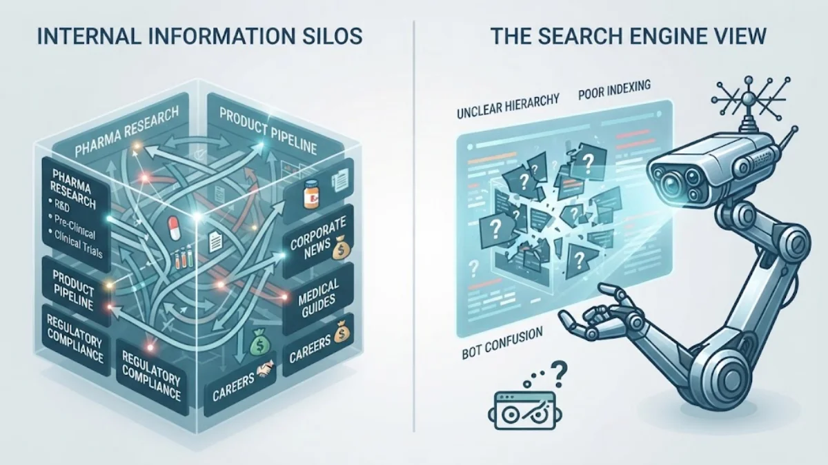
A pharmaceutical website can contain valuable information and still receive limited organic visibility when its pages are poorly structured for search.
Common causes include unclear page titles, duplicate or thin pages, weak internal linking, indexing problems, poorly organized URLs, missing metadata, and multiple pages targeting the same search intent.
This is where pharmaceutical website SEO becomes part of the site’s information architecture rather than simply a keyword exercise.
Each important page should have a clear purpose. Related topics should be connected logically, while substantially different topics should have their own pages.
For example, a company profile, research capability page, product resource, and therapeutic-area page should not all compete for the same search phrase. Their content and page titles should make their individual purposes obvious.
Search optimization should follow the information visitors need. Repeating pharmaceutical, pharma, or similar terms throughout a page does not make the content more useful.
A technically accessible website with well-organized, original, relevant content gives search engines a much clearer understanding of what each page provides.
6. The Design Looks Dated or Does Not Support the Visitor Journey
A website does not necessarily need a complete redesign simply because its visual style is several years old. The more important question is whether the current design still supports the organization’s goals and its visitors.
Problems become more serious when outdated layouts are combined with inconsistent templates, difficult forms, unclear calls to action, weak visual hierarchy, or a poor mobile experience.
Effective pharmaceutical web design should create a visual hierarchy that helps visitors understand what matters on each page.
Important information should be distinguishable from supporting information. Calls to action should be appropriate to the visitor’s intent rather than appearing as aggressive sales messages everywhere.
For pharmaceutical organizations, credibility is particularly important. Consistent typography, professional imagery, accurate information, restrained design choices, and clear company details can contribute to a more trustworthy digital presence.
A pharma website redesign should therefore be based on identified problems rather than visual trends alone.
7. The Website Does Not Give Visitors a Clear Next Step
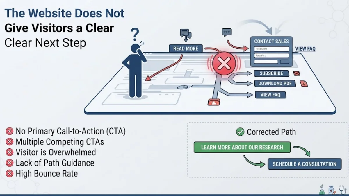
A website can attract visitors and provide useful information without generating meaningful enquiries if the next step is unclear.
Not every visitor wants to make direct contact. Some may want to read a research resource, review company information, explore a product area, find a publication, or understand the organization’s capabilities first.
The right call to action depends on the page.
A resource page might direct visitors toward related information. A corporate page may provide contact details. A partnership page could make business enquiries easier. A recruitment page should lead candidates toward relevant opportunities.
This is one area where pharma website usability and commercial performance meet.
The best approach is to connect each page with a logical next action rather than placing the same generic button everywhere.
When Website Improvements Are Enough
Not every website problem requires a complete rebuild.
If the platform is stable and the main issues involve content organization, page speed, broken links, accessibility, or specific design elements, targeted improvements may provide a better solution.
A larger pharma website development project becomes more appropriate when the existing platform has structural limitations, outdated technology, inconsistent templates, difficult maintenance requirements, or a website architecture that no longer supports the organization’s needs.
Before choosing between optimization and redevelopment, identify the actual problems. This prevents businesses from spending money on a visual redesign when the underlying issue is technical, structural, or content-related.
Pharmaceutical Website Problem Checklist
A professional review should examine the website as a complete system rather than checking individual pages in isolation. The most useful checks include:
- Navigation and information architecture
- Mobile layout and page performance
- Content clarity and accuracy
- Accessibility and readable page structure
- Technical SEO and indexing
- Broken links and outdated resources
- Forms, contact paths, and calls to action
- Website security, software, and technical maintenance
The priority should be determined by the effect each problem has on visitors and the organization’s objectives.